Clarity Design System
- Visual Design
- Product Design
- Design Technology
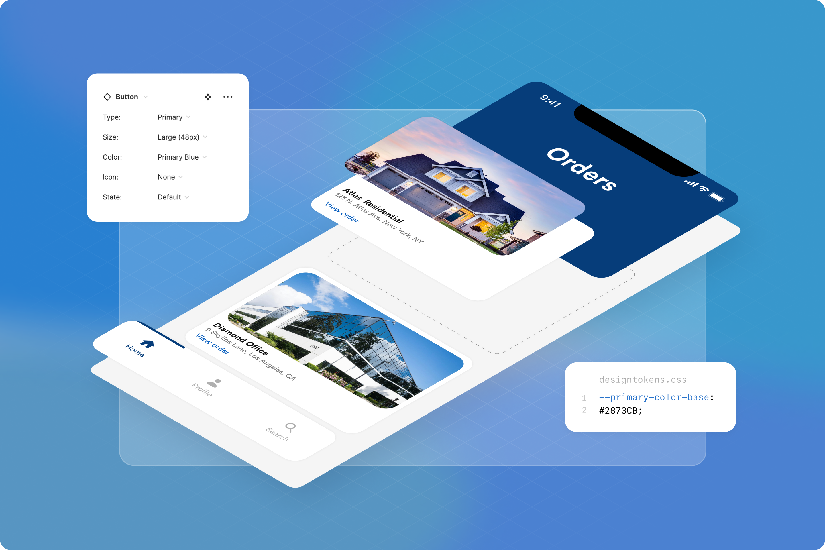
Clarity is the design system for the ClarityFirst application by First American NCS. I was a founding member, collaborating with teams to develop solutions, build tools and systems, and lead the roadmap and strategy for the design system.
As the suite of features for the ClarityFirst application grew, maintaining a coherent, seamless user experience became increasingly challenging, and front-end development faced many hurdles.The product lacked coherence as teams worldwide operated in silos, leading to conflicting work, and duplicate or similar code.
The component library was under utilized due to inadequate documentation and a lack of awareness among designers and engineers. Product designers often faced conflicting or no guidance, forcing them to address design problems ad-hoc. Code was frequently copied and pasted from the component library into applications, creating complex, non-reusable components.
The Process
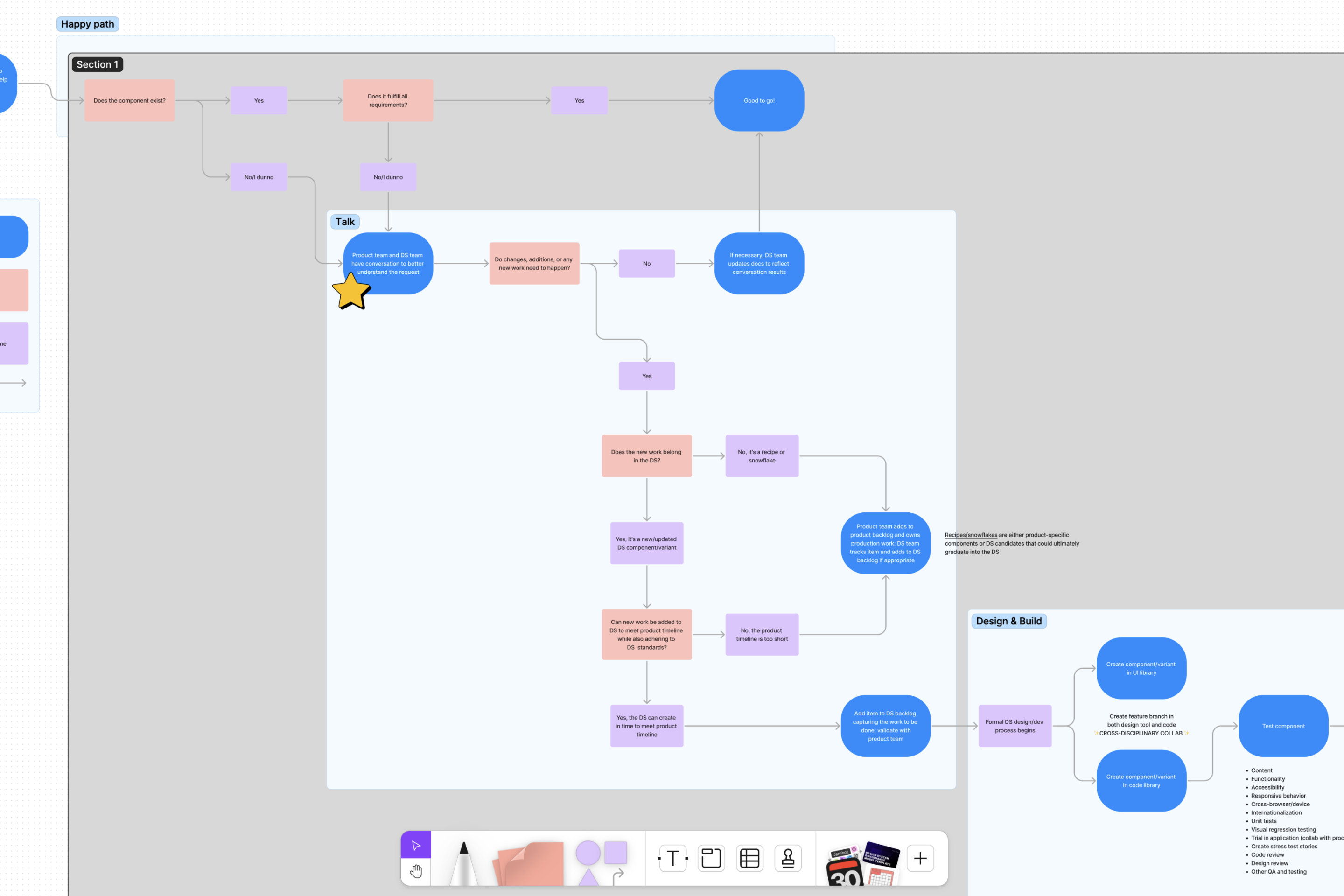
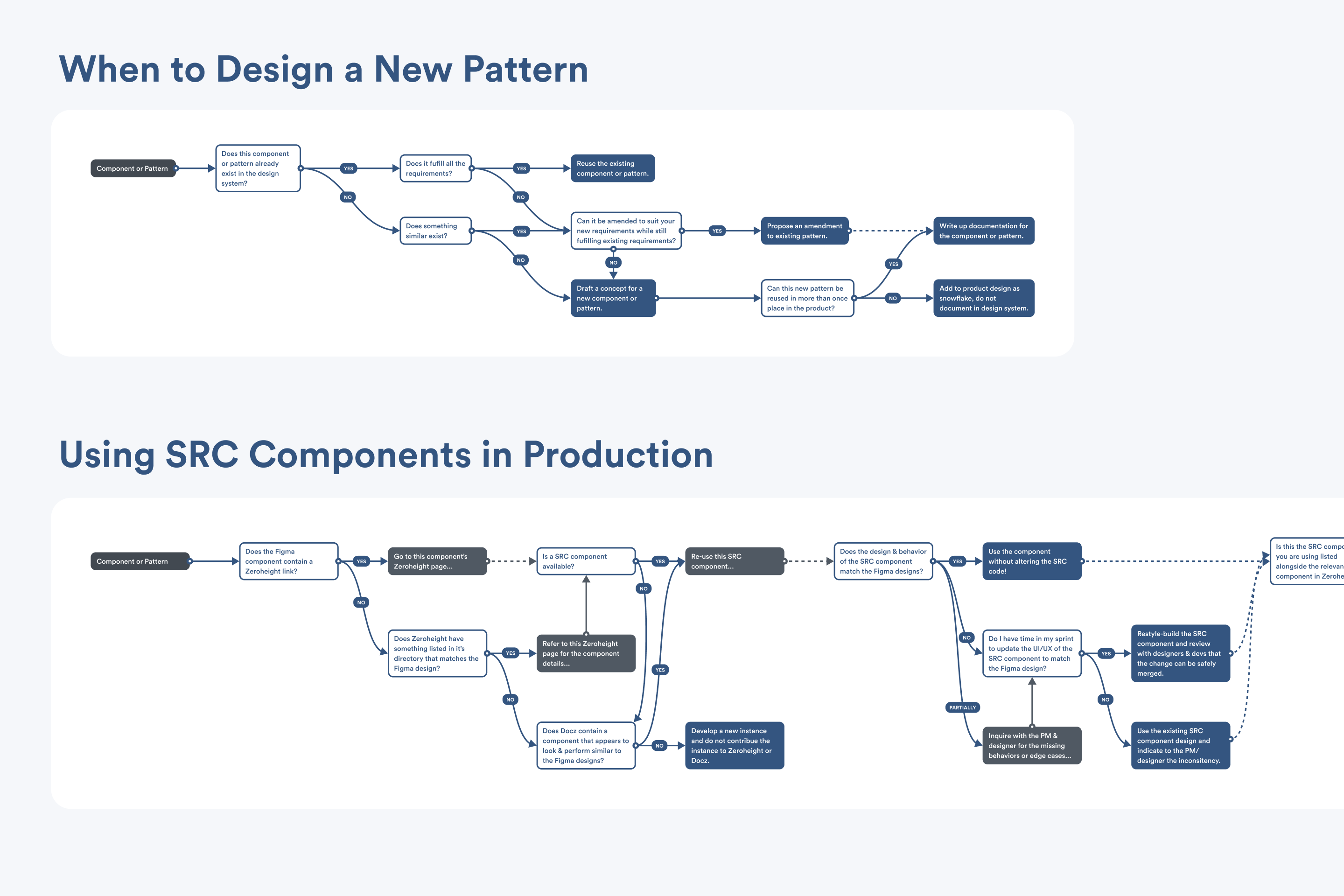
A design system aims to provide frameworks, guidelines, and tools for more efficient and consistent development and user experience. To assist in developing a roadmap and plan, a governance model based on Brad Frost's system was developed to establish processes and help identify what needed to be designed and built.
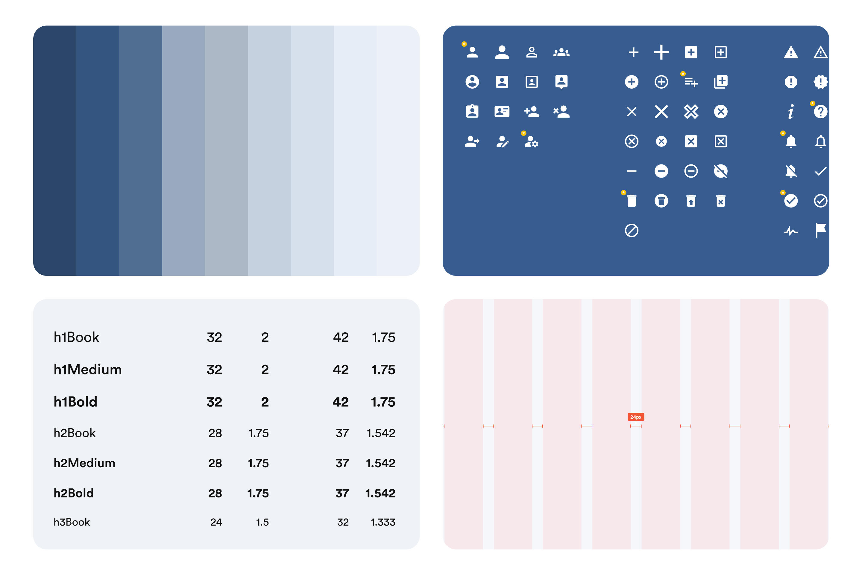
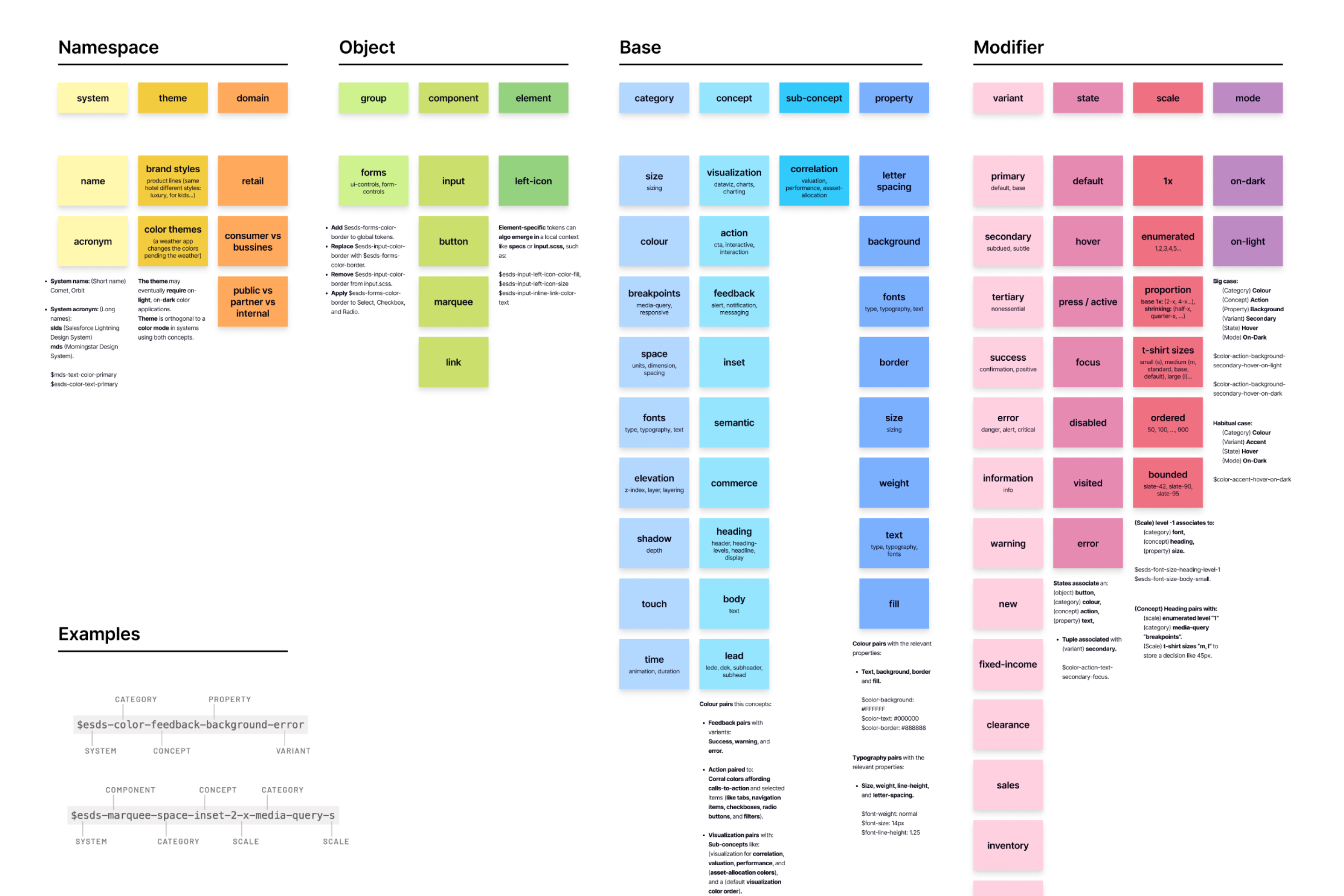
The existing Style Guide created by the marketing team, offered a blueprint for colors, fonts, and logo treatments, assisting in the data collection for the design system. I explored the ClarityFirst application, thoroughly analyzing features and functionalities to identify similarities and unique elements. Code searches were conducted to document existing CSS properties that could be converted to design tokens, such as colors and typography. These potential design tokens were grouped, categorized, refined, and compiled for documentation.
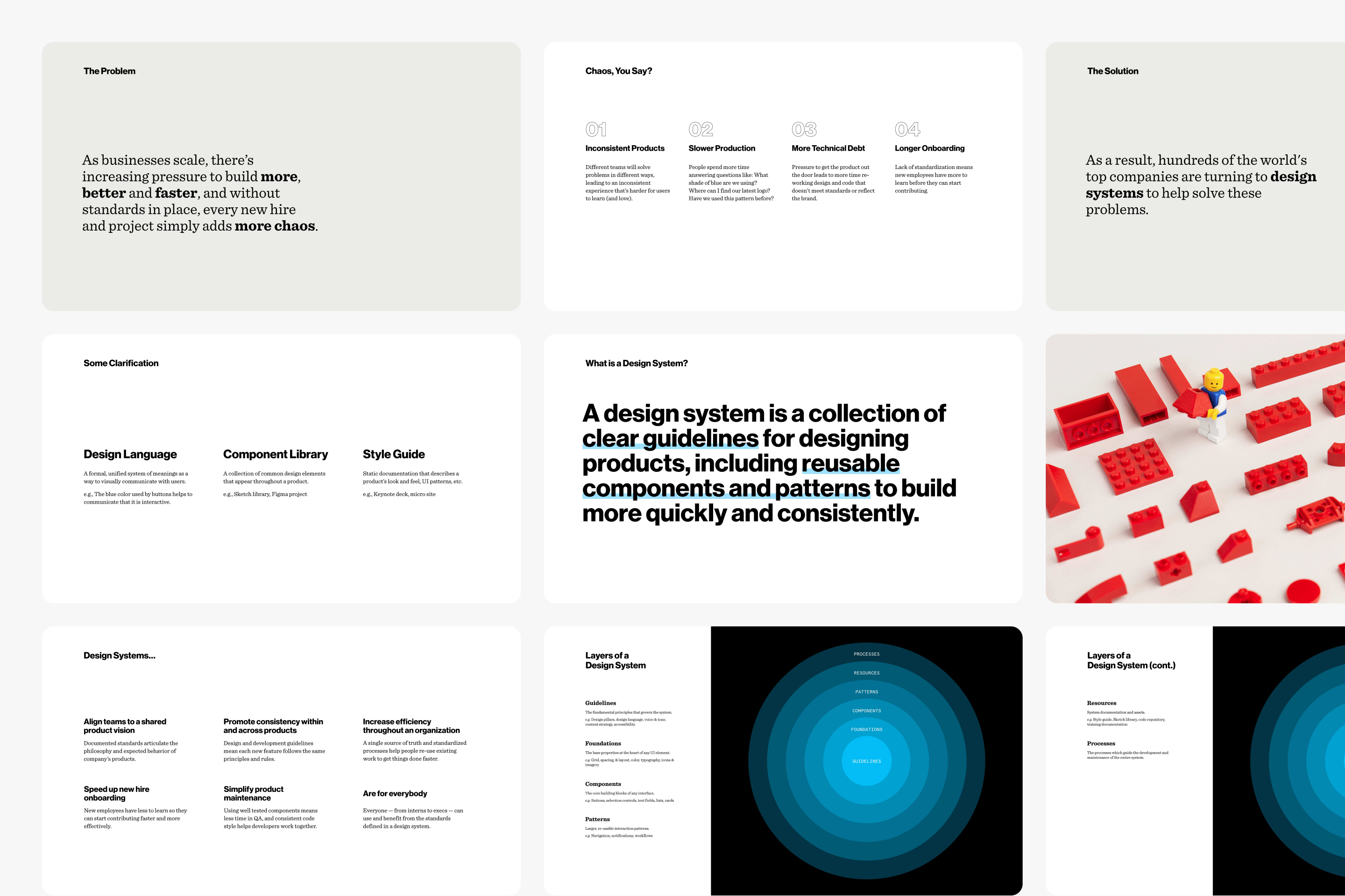
Before moving forward with the design system roadmap, I wanted to ensure that all stakeholders, including the Business, Product, and Engineering teams, were aligned and onboard. To achieve this, I organized a comprehensive meeting that invited everyone in the organization. During the meeting, I presented the design system plan, highlighting its benefits, establishing the vision, and addressing any concerns. This session aimed to evangelize the design system, fostering a shared understanding and commitment across all teams, ensuring a cohesive and unified approach moving forward.
Additionally, I participated in design and code reviews to gain further insights and observe the design and engineering processes. I also interviewed the cross-functional teams to gather insights into the design system's strengths and weaknesses, which helped prioritize improvement tasks.
The Solution
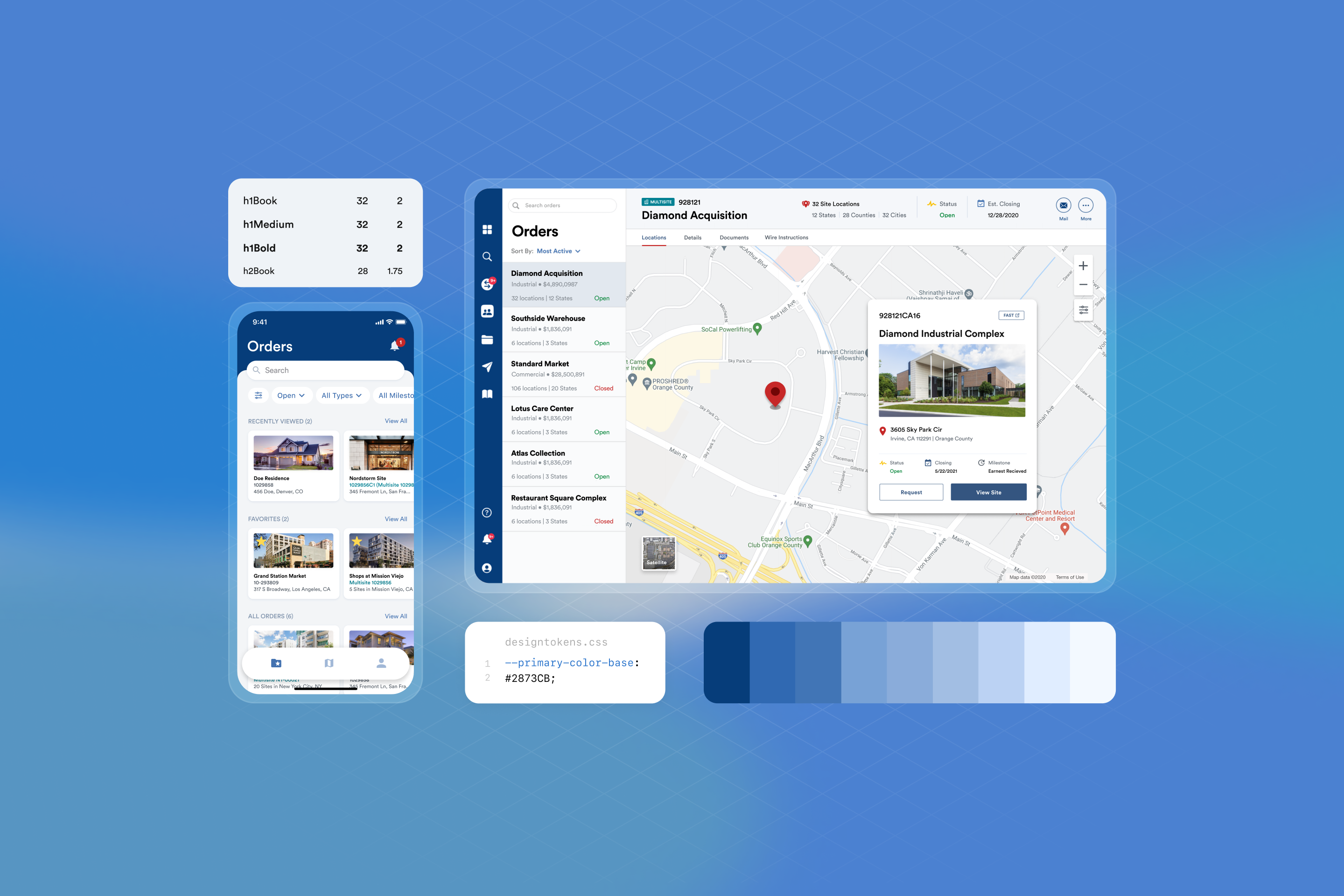
A transformative design system is born. Engineering teams can now efficiently utilize global components, layouts, and templates to develop new products, pages, and features. This has resulted in better alignment between the design and product teams with the company's goals and the product's future, leading to more consistent output from everyone involved. There is now a significant improvement in the consistency of user experience and brand language throughout the platform.
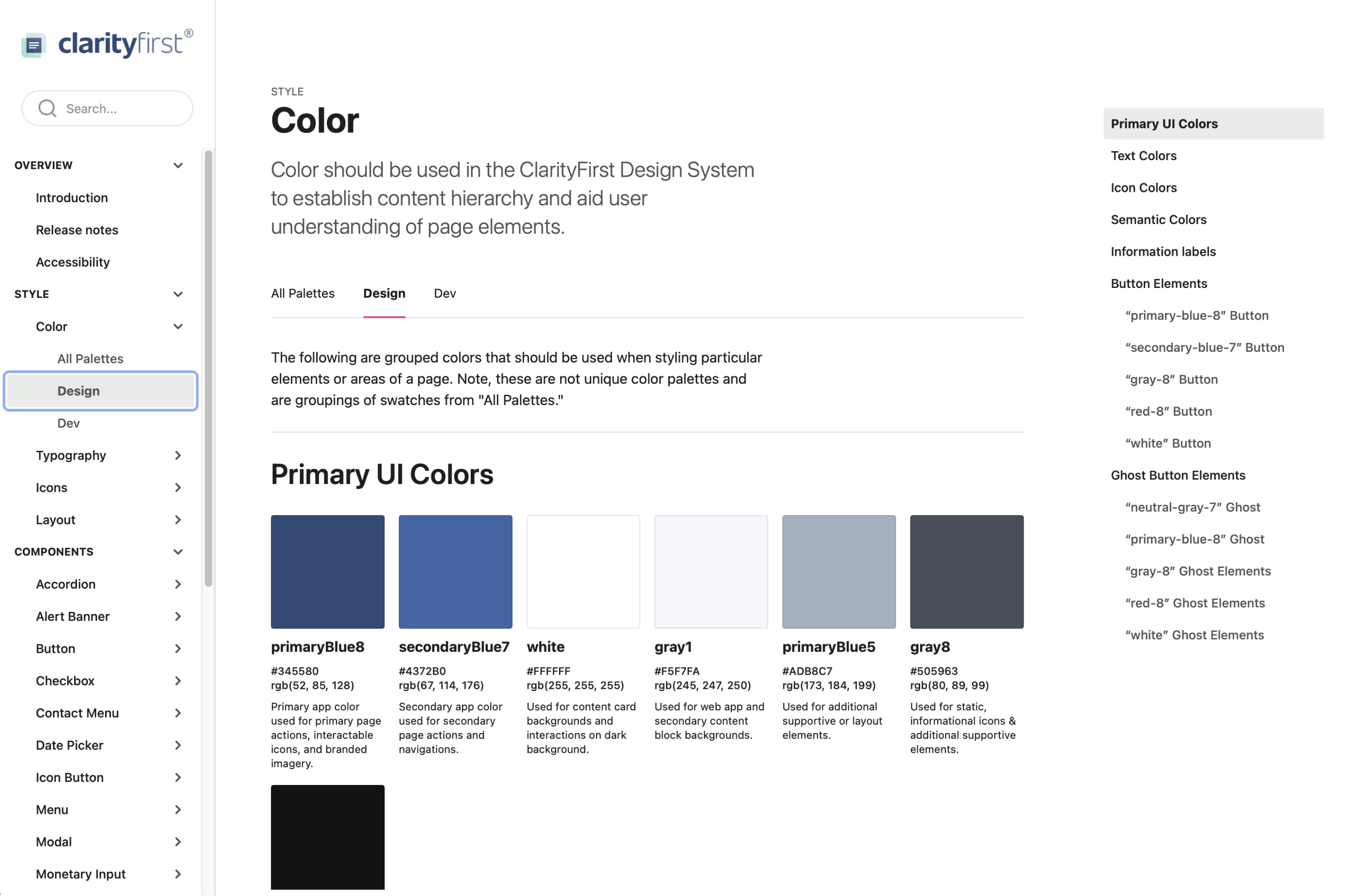
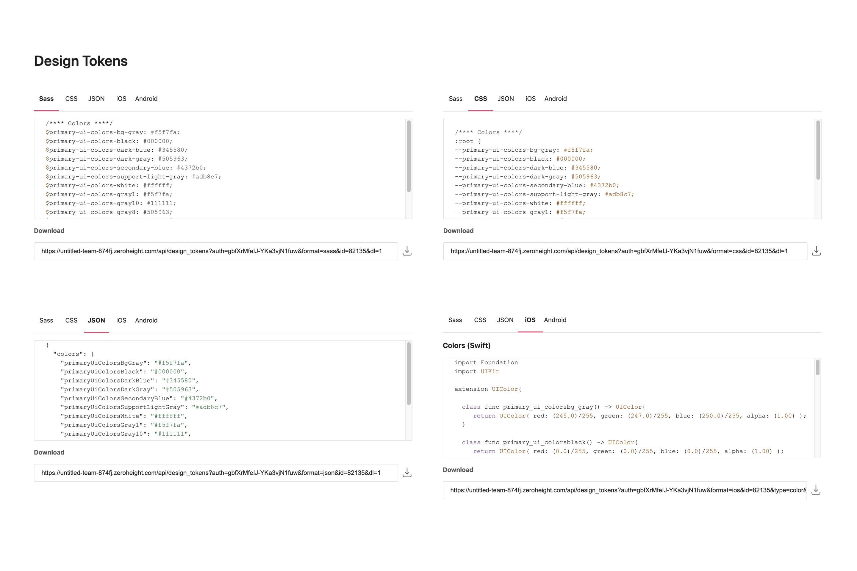
Design tokens and foundations.
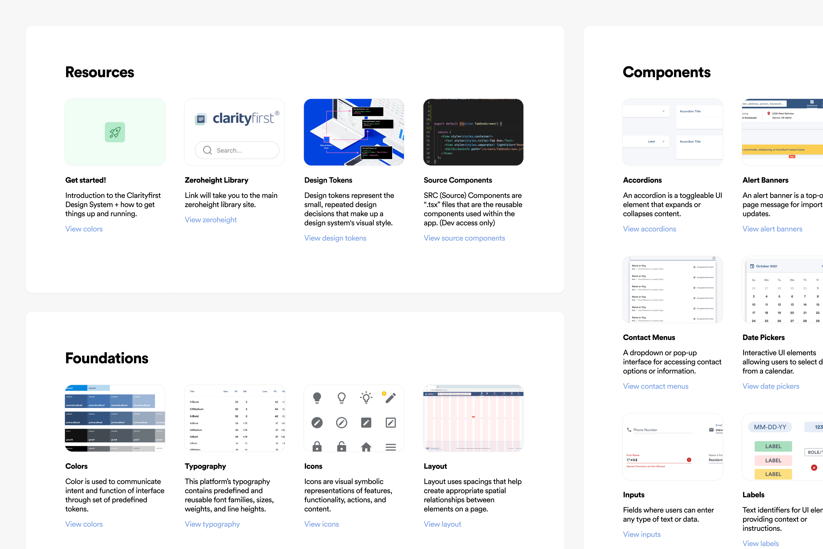
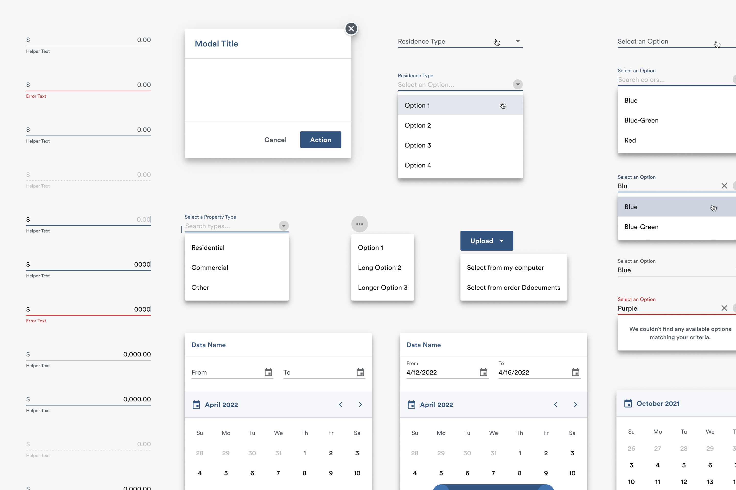
I developed the fundamental building blocks of the design system by establishing design tokens, atomic components, and building foundations. This will provide consistency and modularity across designs, components, and layouts as the foundation for the ClarityFirst platform.
Comprehensive evolving documentation.
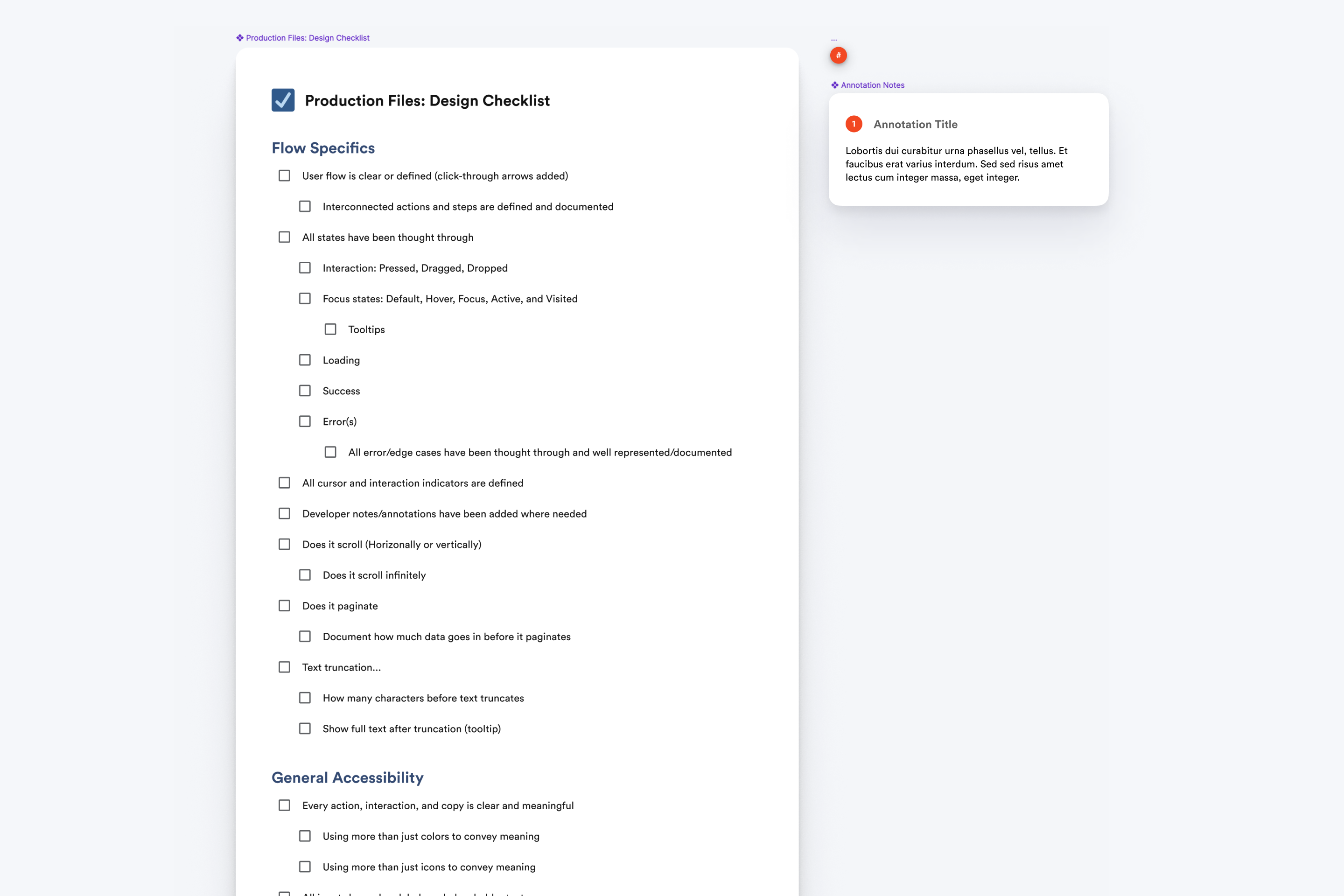
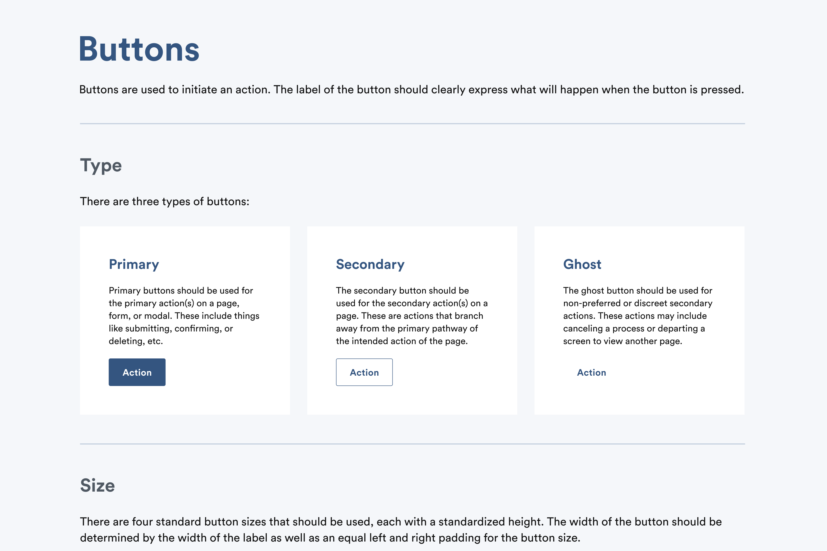
All teams now have access to an evolving and progressive file that provides detailed descriptions and links to resources, components, and foundational information. I created comprehensive documentation for onboarding, setup, and guidelines that supported consistent implementation across the application. All of this information is imported into a Zeroheight website for non-technical stakeholders to view.
Faster prototyping.
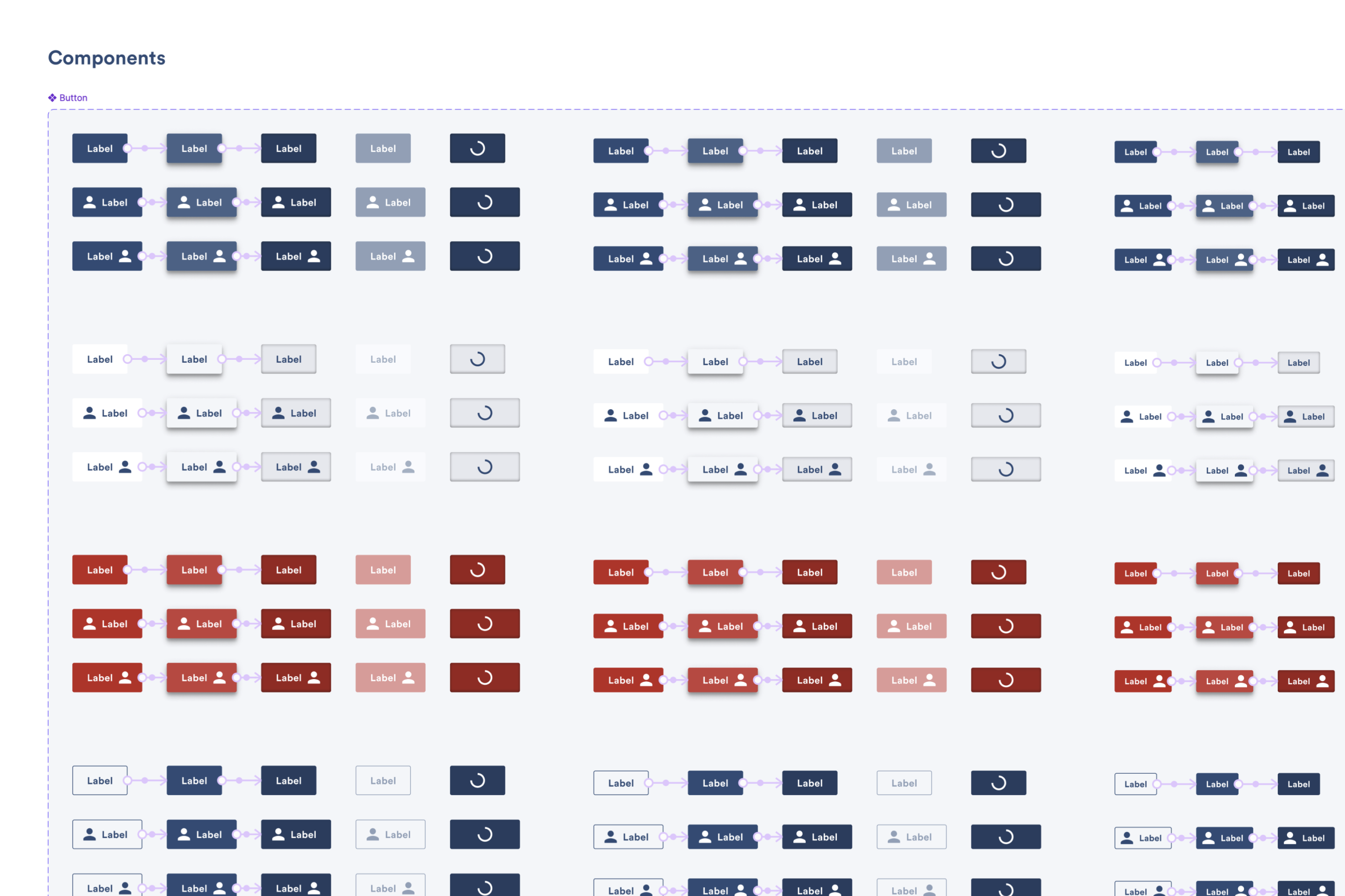
Interactive components were implemented to facilitate quick prototype creation, showcasing interactions between variants in a component set. Interactions are pre-configured and ready to use. This not only saves time in designing prototypes but also allows non-design stakeholders to fully understand the component's variations and states.
Accessibility in mind.
The design system provides accessibility guidelines for color pairings to pass WCAG 2.1 AA minimum contrast ratios. Click targets are ensured having at least 16x16px on desktop and 44x44px on mobile for accessibility. All interactive elements include a focus state, triggered by keyboard tabbing, with a highlight around the element, using blue on light backgrounds and yellow on dark backgrounds, choosing the higher contrast option. Tooltips text appear when the element is focused. Established an accessible hierarchy using size, color, and weight, ensuring focus order flows in a left-to-right "Z" pattern for keyboard navigation, aiding users with impairments.
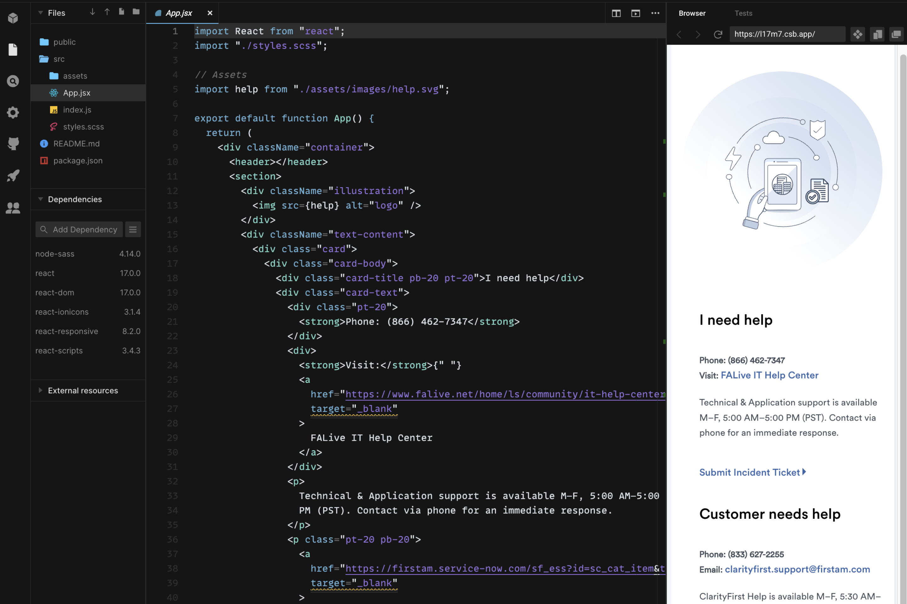
Answer to snowflakes/unique patterns.
If the design system lacks a specific pattern, individual components or foundations can be enhanced, but unique patterns are harder to address. For a smooth hand-off, I provide a ready-to-use sample of the component in code within the relevant environment (React, Angular, etc.). Typically, I use Codesandbox, so I don't disrupt anything in the environment if there is no Storybook instance.
Impact
- Improved product experience quality
- Became design standard platform wide
- Reduced development timelines by 32%
