Investor Portal

- UX Research
- Product Design
- Creative Direction
- Business Strategy
Investor Portal (SaaS) by Verivest provide investors access to a powerful portal to manage all investment information. A centralized location online that holds statement, reports, and tax documents for peace of mind.
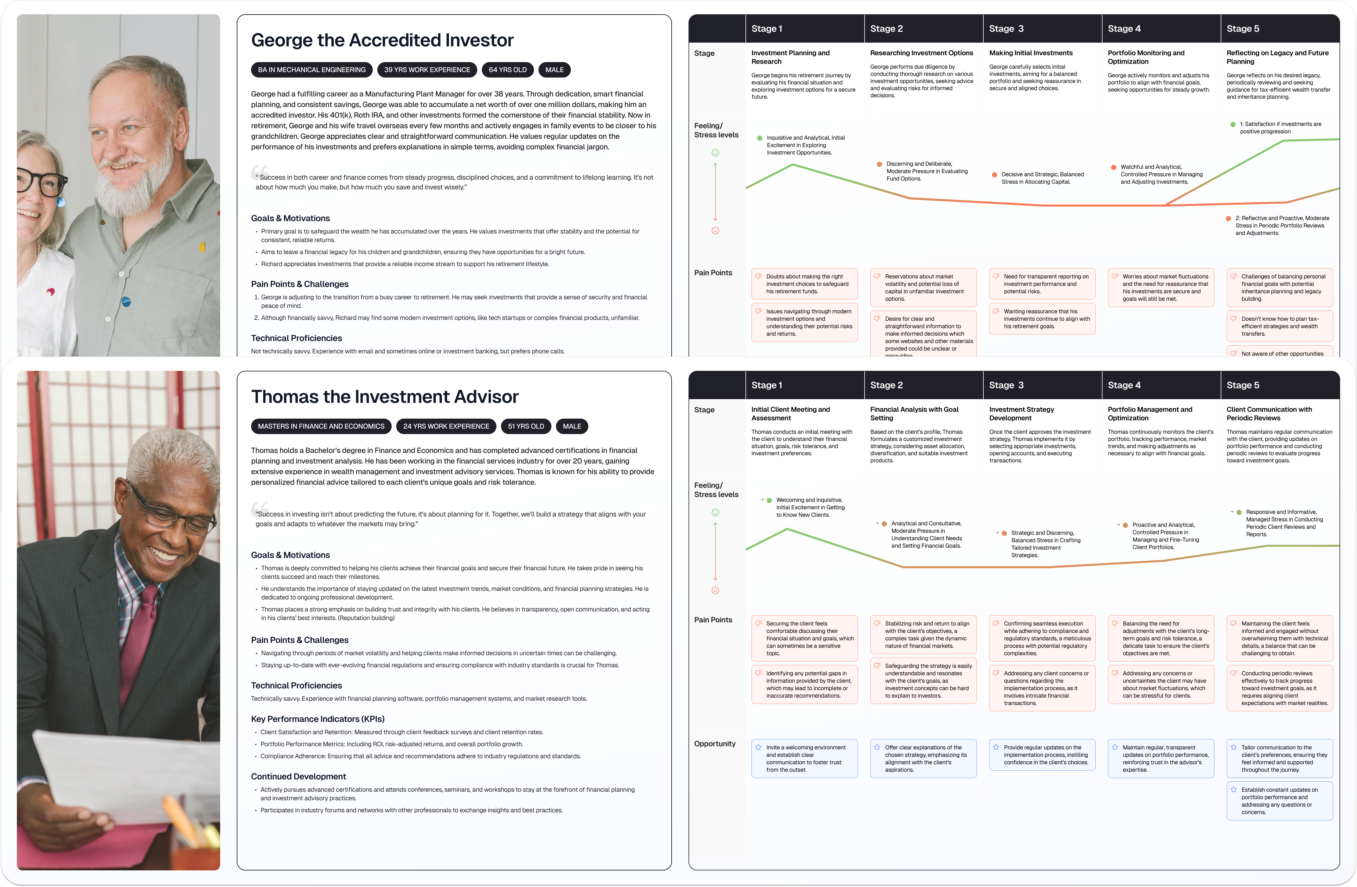
Real estate investment programs traditionally cater to a diverse demographic, with many investors being over the age of 50 and potentially lacking technical proficiency. These older users often feel anxious and concerned about their investments due to a lack of understanding of how to use the portal. Consequently, they frequently reach out to support for assistance or submit complaints, which has been a major pain point of the product.
As an edge case, the portal also caters to technically savvy investors in their late 20s to early 40s who are well-versed in using modernized financial applications that are requesting for more advanced, robust features.
The objective was to enhance the user experience and interface design to optimize usability across a diverse age range, aiming for a delicate balance to ensure the design remained intuitive and straightforward enough to navigate without the need of guidance.

The Process
I diligently conducted in-depth interviews, meticulously collecting insights and key information. This involved engaging with external users, such as investors using the portal, as well as internal teams responsible for investor communication, including fund administrators, managers, advisors, and investor relations.
It was crucial to gather all perspectives to formulate detailed personas and user journeys through empathy mapping. This approach allowed me to accurately pinpoint feelings, stress levels, and successes. By gaining a thorough understanding of goals, problems, and motivations, I uncovered opportunities for feature enhancements within the platform to further elevate the user experience.
Upon discovering that the current investor portal platform significantly lacks essential features and desired functionality, I prioritized integrating these much-needed features into the solution.
It became evident that fund managers perceive this portal as an extension of their brand identity. White labeling is paramount to them, allowing for extensive customization to ensure that the platform truly embodies their company branding.
Recognizing the potential for a more profound solution for the investor portal, I began studying Apple's Human Interface Guidelines with the intent of modeling the portal as an Operating System (OS). Apple's products are dedicated to improving user experiences by making application interfaces more intuitive, learnable, and consistent. Ultimately, I aimed to leverage this research data and interface guidelines to find the best solution.
After transforming low-fidelity wireframes into high-fidelity prototype mockups, I used the prototype to conduct non-moderated usability testing sessions with investors.
The evaluation of the prototype solution's success was solely based on criteria such as ease of use, navigation, and accessibility, ensuring an unbiased assessment. During testing, I documented requested modifications, identified issues requiring attention, and noted users' favorite features, all of which contributed to further refinement in the iterations of the user experience design.

The Solution
The new and improved white label Investor Portal offers a minimalist, user-friendly interface, enabling private investors of all ages to manage their real estate funds and syndications seamlessly on both mobile phones and computers.
Specifically tailored for real estate funds and syndications, this platform empowers private investors to effortlessly manage their investments, access statements, reports, and tax documents—all conveniently centralized in one location accessible from both mobile phones and computers.
Sleek white label.
Fund managers have the flexibility to customize accent colors, including buttons and banners, to authentically reflect their brand identity, providing a true white label experience.
All-in-one dashboard.
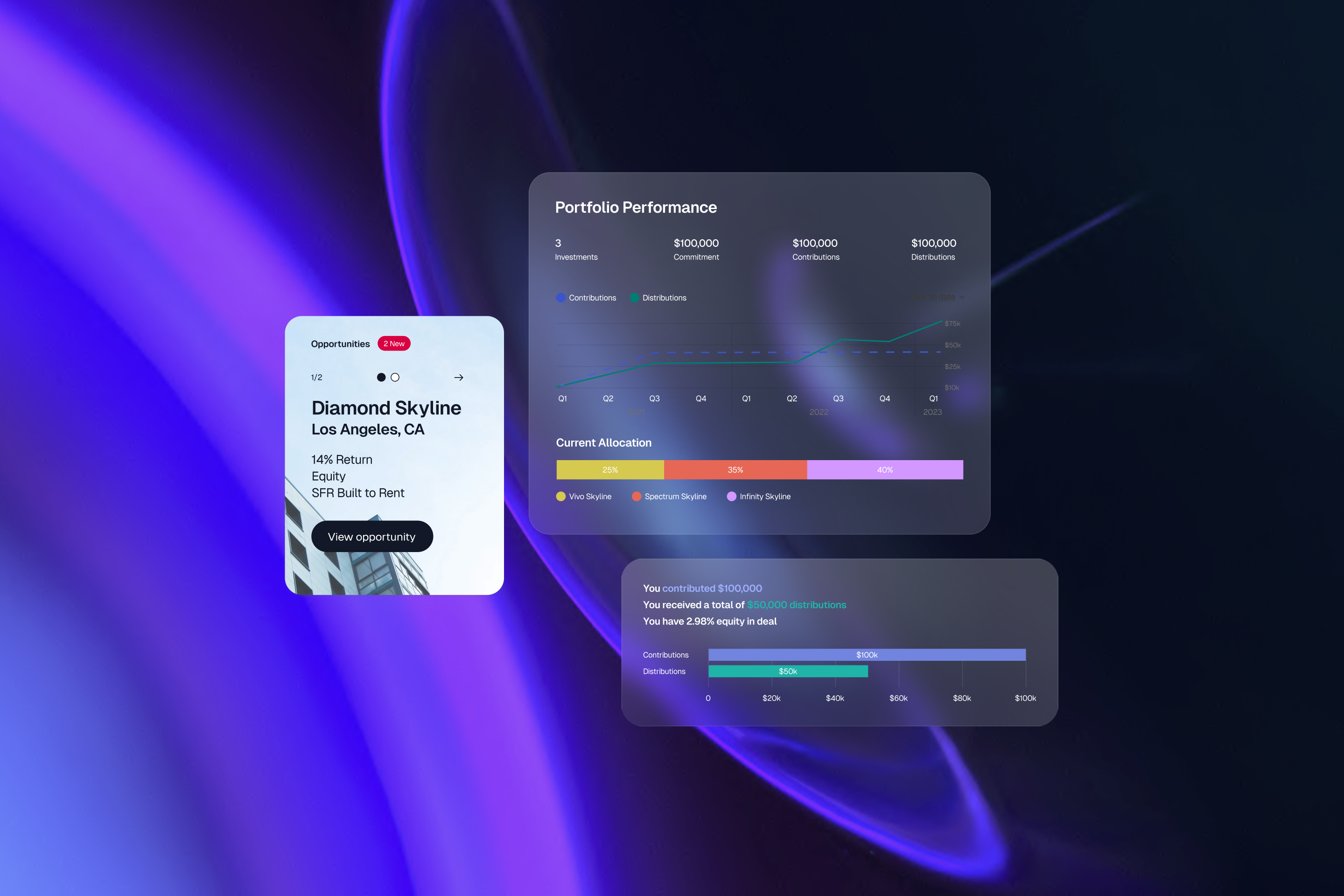
The investor is greeted with a sleek dashboard, designed akin to Apple iOS products, facilitating convenient display and easy navigation to investment opportunities, current investments, financial activity, and documents.
The user needs above all else.
If the user requires assistance, they can readily access self-help articles, or alternatively, opt for support chat or phone contact via the designated contact always displayed on the left side of the screen.
For enhanced customizability, users can seamlessly alternate between light mode and dark mode, catering to specific accessibility preferences or vision impairments.
Enticing opportunities.
Fund managers can prominently showcase open opportunities alongside detailed insights and past opportunities, enabling investors to review missed opportunities. A precise returns calculator empowers investors to envision potential gains, facilitating informed decisions.
Easy account management.
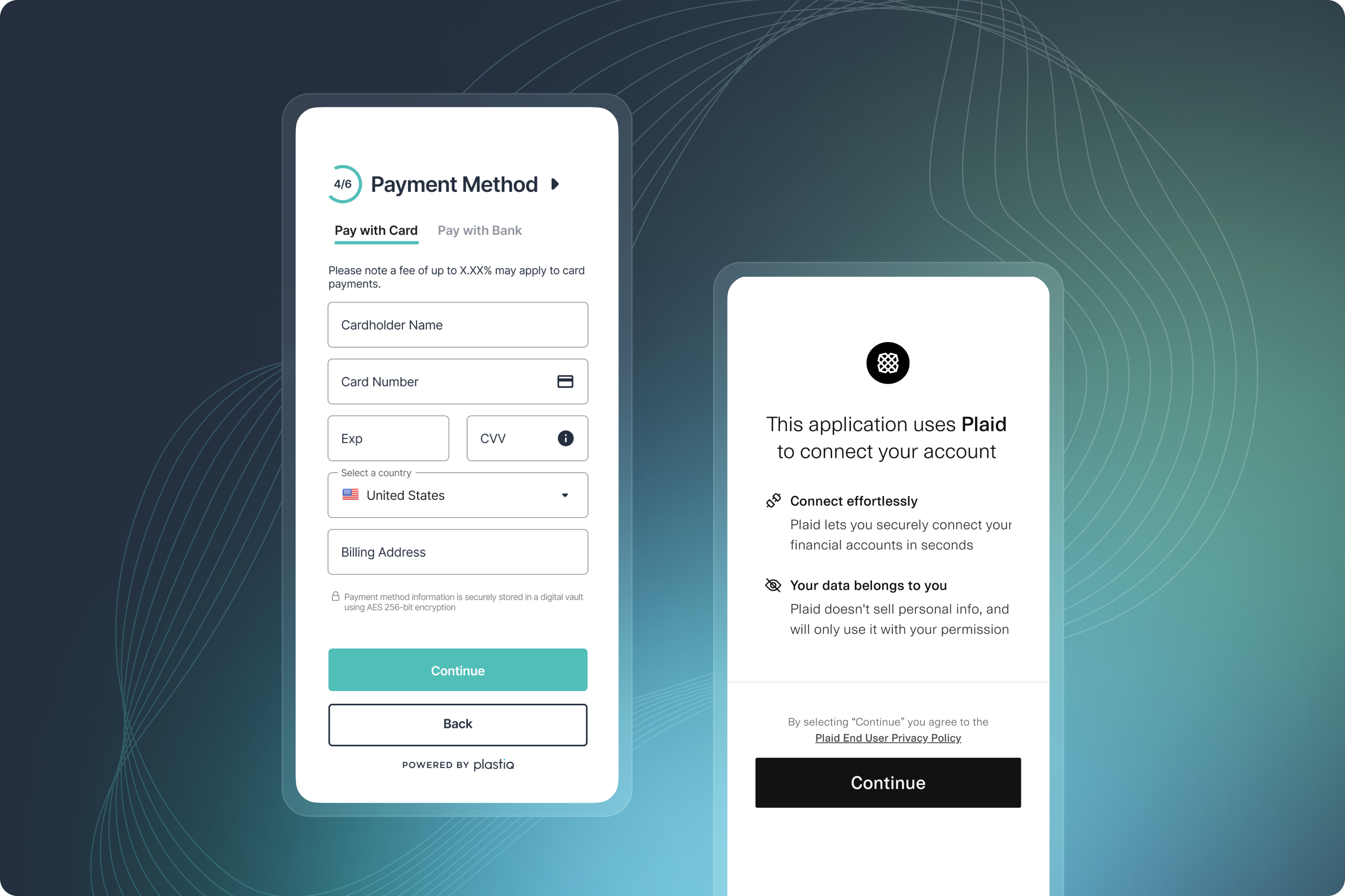
Investors benefit from the ease of managing accounts, with options to add, edit, or delete accounts without the need for support intervention.
Information on demand.
Users can easily view their portfolio performance and detailed transaction insights. A document repository offers quick access to essential investment information.

